Recycles Rebrand
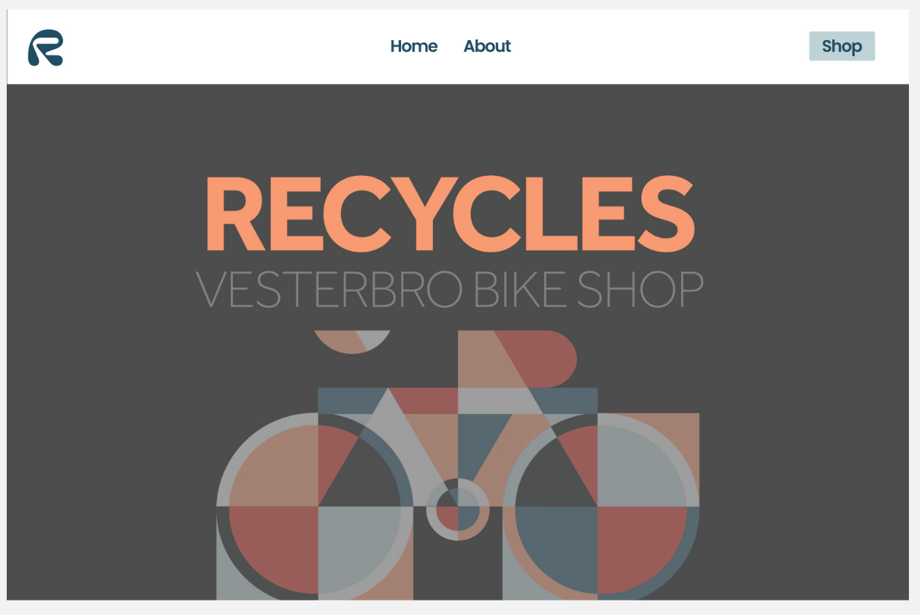
Project Goal: Recycles is a bike shop in Copenhagen, Denmark. While I was living in Copenhagen this year, I was tasked with rebranding their shop. The bike shop specifically focuses on vintage bike frames and brings new use to these frames with new parts. Hence the name, Recycles. Below are some ways I reworked the brand to aid the shop in correctly reaching their audiences in an effective and creative way.
Target Audience: 20-40 year-olds living in Copenhagen
Tools: Adobe Illustrator, Adobe Photoshop, Adobe XD
Role: Illustrator and brand designer
Role: Illustrator and brand designer

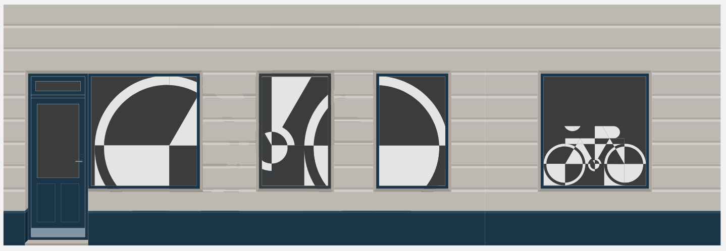
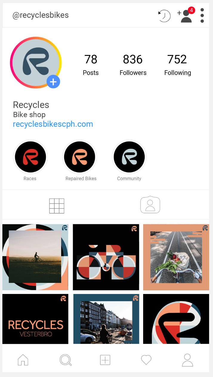
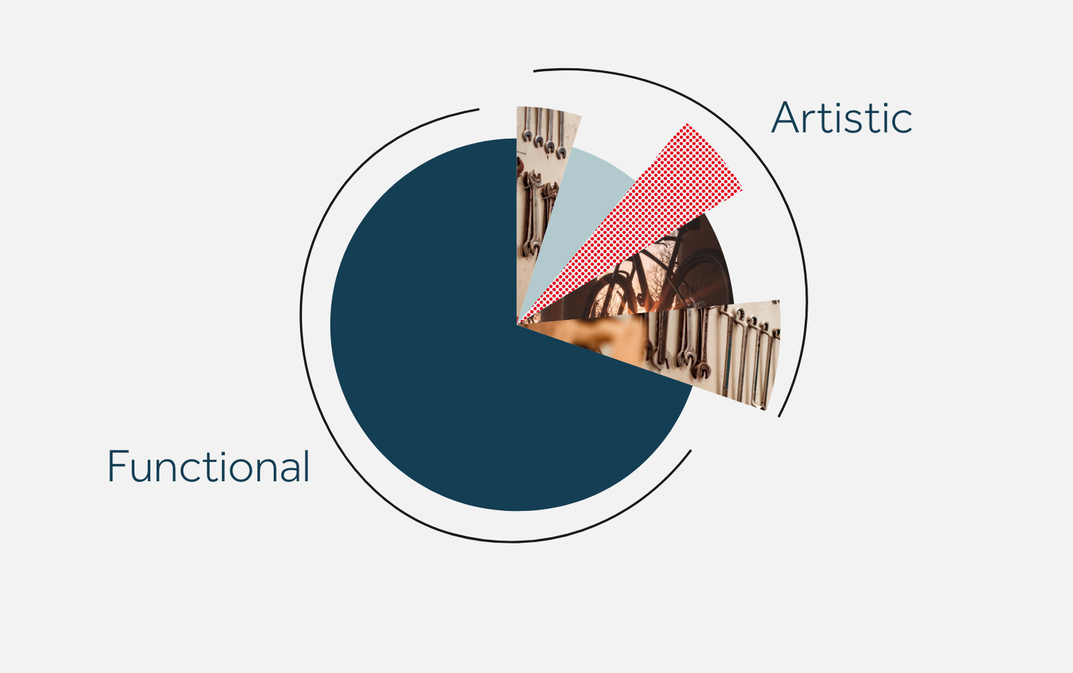
This project was meant to showcase Recycles as a brand but also the neighborhood they’re in. Vestobro in Copenhagen is very hip and full of younger creative people. Everything I branded for this shop is meant to reflect their brand voice and how that can be spun in a more playful way. Therefore when starting my branding 70% of my designs are functional, readable, and accessible. The other 30% of my work would showcase the personalities working at the shop, the customers, and the surroundings.
Tour de France Jerseys colors have meaning?
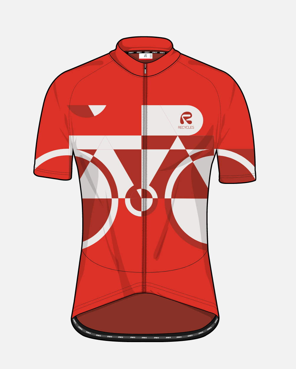
Before this project, I had no knowledge of the Tour de France jersey actually meant something! I decided to encoporate that into my designs and let the jerseys inform my color choices. My orange color came from yellow, my teal came from the green, and the red polka dots are encoporated into my illustrations. I changed the colors to reflect the brand I created while playing with the shop’s roots in races.
Yellow
Yellow
The maillot jaune- overall leader of the race so far
Green
The maillot vert- the sprinter’s jersey
White with red polka dots
The maillot à pois rouges- King of the Mountains
Illustrations:These illustrations follow the colors of the brand and are accessible and easy to understand. These can easily incorporate type to make event posters or announcements while still having a fun design. These illustrations were also designed to be put up as posters within the shop.
